|
By
Peg Carmack Short
In
an era when typography seems to be tending toward
anarchy, and "the rules are there are no rules,"
must an artist live by this maxim in order to
receive acclaim and popularity? Dennis Ortiz-Lopez,
who for over 20 years has been designing type
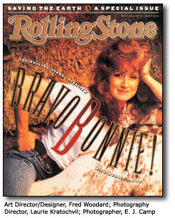
and hand lettering for popular titles such as
Rolling Stone, Sports Illustrated,
Self, and, says, "there is an all-American
trend for the '80s and the '90s-and I think it's
a bad trend-to accept almost anything. I don't
think you should have to break all the rules in
order to do something good."
Ortiz-Lopez
favors serif fonts and legible type. "You should
never have to think about what type says. You
should be able to think about what it says to
you," he comments. "You shouldn't have to decipher
what it says, and that's the problem with a lot
of modern faces today."
His
early interest in type stemmed from his father
who he says was a "letterer of sorts." There were
always type books as his house and, while still
a teenager, Ortiz-Lopez discovered his talent
for doing posters. He drew his first alphabet
right after high school, and his only formal training
in lettering was a few courses at California State,
Long Beach. However, by this time he was already
an established letterer and graphic designer.
But
one of those early courses taught him lettering
from the typographer's point of view and some
of the rules by which he still designs type. While
he is an accomplished Mac user, Ortiz-Lopez sees
the computer as something of a mixed blessing.
Capable of accessing enormous potential, it at
the same time can erode design standards. As he
puts it, "It [computer] puts a great deal of technology
and skill together in a piece of hardware, so
that anybody, no matter how lacking in taste,
can on a shoestring budget produce something very
professional looking-not necessarily effective
or tasteful, but professional looking." Ortiz-Lopez
was himself resistant to the Mac at first, but
then he realized unless he wanted to go the way
of the dinosaur, he would have to give it a try.
But at first he found it would take 12 hours or
more to do on the Mac what he could produce by
hand in an hour and a half. "A few years ago,
it was a worthless tool, I couldn't do anything
with it. I couldn't produce artwork with any major
dynamics. Then the PostScript applications were
a great deal more limited than they are today."
However,
with the development of Altsys' Fontographer,
he was able to begin more successfully using the
Mac. Now he uses it almost exclusively. He has
licensed more than 20 fonts and developed a Hebrew
language keyboard that allows phonetic typesetting.
Anyone who knows the sounds of the letters should
be able to typeset Hebrew. It allows anyone with
a word processor to set Hebrew on the Mac without
the use of the special Hebrew finder. The 22 Hebrew
letters and 5 final forms fit into a standard
keyboard.
Ortiz-Lopez
markets two Hebrew fonts. One of them, called
Qumran Torah Script, is designed for use in translating
the Dead Sea Scrolls and matches the script found
in those texts. The second, Hebrew Graphic, is
a more contemporary, angular version. They are
both designed to use with Adobe Illustrator.
Much
of Ortiz-Lopez' work is still developing custom
fonts for magazines and other editorial clients,
but he rarely produces the hand lettering and
special photographic effects for which he first
became famous.
Although
he has gone desktop, he still cautions designers,
"Don't depend on the desktop to do everything
for you." He still recommends that for really
high quality output, color work and complex trapping,
a skilled color separator is the best choice.
Further
design advice he offers is, "When it comes to
type and type usage, never stretch a font beyond
its boundaries. Don't modify something to the
point where it looks distorted. When that happens,"
he warns, "the reader doesn't notice the message
before he notices the oddity. You don't want the
type to catch the attention of the reader's eye
more than the message." His number one taboo is,
"Never condense anything to the point where the
verticals are thinner than the horizontals."
This
doesn't mean that Ortiz-Lopez doesn't believe
in special effects like type going back into space
or curing around an object. He just goes back
to the earlier rule, "Special effects are o.k.
as long as you still retain legibility."
Maybe
that's why Ortiz-Lopez is so popular with prominent
editors and art directors and his magazine client
list reads like a "Who's Who" of the world of
magazine publishing.
In
a world where many seem to have forgotten the
purpose of type, it is good to know that talents
like Ortiz-Lopez understand the basic rules. "There
is only one purpose to type," he says. "It's there
to give a message, convey a thought, project an
idea; it's there to produce an image in your mind.
And if you can't figure out what it says, what's
the point?" .
Articles
included here are copyrighted by Peg Carmack Short
and may not be copied in full or part without
written permission of the author.
return
to the articles page
top
|